How to Create a Responsive Card Slider in HTML, CSS & JavaScript: A Complete Guide
Creating a responsive card slider is a popular feature for modern websites. It provides a sleek way to display content like images, text, or products in a scrollable format. In this article, we’ll guide you through the process of building a responsive card slider using HTML, CSS, and JavaScript.
Step 1: HTML Structure
First, create the basic structure for the card slider. Below is a simple HTML template:
<!DOCTYPE html>
<html lang="en">
<head>
    <meta charset="UTF-8">
    <meta name="viewport" content="width=device-width, initial-scale=1.0">
    <title>Team Profile Slider</title>
    <link rel="stylesheet" href="styles/card-slider.css">
    <link rel="stylesheet" href="https://cdnjs.cloudflare.com/ajax/libs/font-awesome/6.0.0/css/all.min.css">
    <link href="https://fonts.googleapis.com/css2?family=Poppins:wght@300;400;500;600;700&display=swap" rel="stylesheet">
</head>
<body>
    <div class="wrapper">
        <i id="left" class="fa-solid fa-chevron-left"></i>
        <div class="carousel">
            <div class="card">
                <div class="img">
                    <img src="https://randomuser.me/api/portraits/men/32.jpg" alt="James Wilson">
                </div>
                <h2>James Wilson</h2>
                <div class="role">Software Developer</div>
                <button class="message-btn">Message</button>
            </div>
            <div class="card">
                <div class="img">
                    <img src="https://randomuser.me/api/portraits/women/65.jpg" alt="Zoe Olivia">
                </div>
                <h2>Zoe Olivia</h2>
                <div class="role">Fashion Designer</div>
                <button class="message-btn">Message</button>
            </div>
            <div class="card">
                <div class="img">
                    <img src="https://randomuser.me/api/portraits/men/44.jpg" alt="David Brown">
                </div>
                <h2>David Brown</h2>
                <div class="role">Graphic Designer</div>
                <button class="message-btn">Message</button>
            </div>
            <div class="card">
                <div class="img">
                    <img src="https://randomuser.me/api/portraits/women/33.jpg" alt="Emma Stone">
                </div>
                <h2>Emma Stone</h2>
                <div class="role">UI/UX Designer</div>
                <button class="message-btn">Message</button>
            </div>
            <div class="card">
                <div class="img">
                    <img src="https://randomuser.me/api/portraits/men/55.jpg" alt="Michael Chen">
                </div>
                <h2>Michael Chen</h2>
                <div class="role">Product Manager</div>
                <button class="message-btn">Message</button>
            </div>
        </div>
        <i id="right" class="fa-solid fa-chevron-right"></i>
        <div class="pagination-dots">
            <span class="dot active"></span>
            <span class="dot"></span>
            <span class="dot"></span>
            <span class="dot"></span>
            <span class="dot"></span>
        </div>
    </div>
    <script src="js/card-slider.js"></script>
</body>
</html>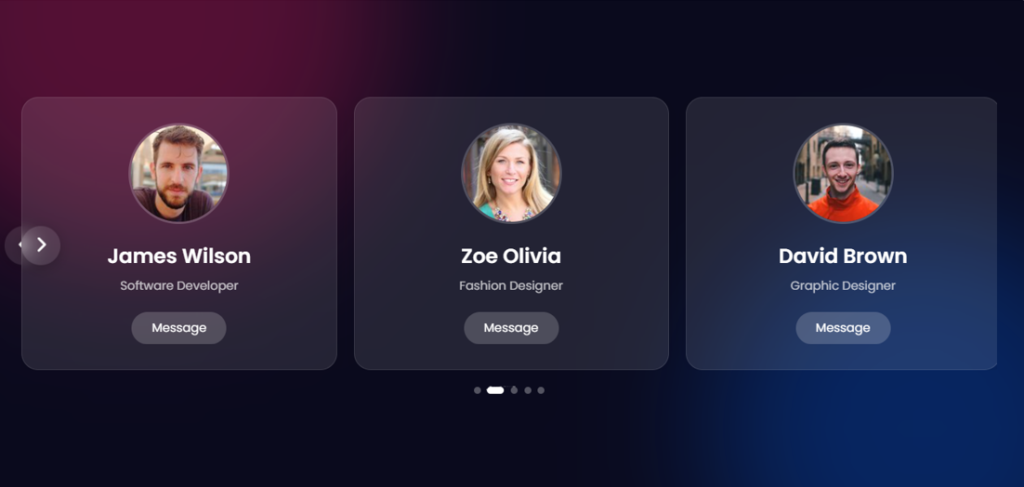
Step 2: CSS for Styling the Slider
Add CSS to style the card slider and make it responsive. Below is an example of basic styling:
* {
    margin: 0;
    padding: 0;
    box-sizing: border-box;
    font-family: 'Poppins', sans-serif;
}

body {
    display: flex;
    align-items: center;
    justify-content: center;
    min-height: 100vh;
    background: #0a0a1d;
    position: relative;
    overflow: hidden;
}

/* Background gradients */
body::before {
    content: '';
    position: absolute;
    top: -50%;
    left: -10%;
    width: 600px;
    height: 600px;
    background: #ff1f6b;
    border-radius: 50%;
    filter: blur(80px);
    opacity: 0.3;
    z-index: 0;
}

body::after {
    content: '';
    position: absolute;
    bottom: -30%;
    right: -10%;
    width: 500px;
    height: 500px;
    background: #0066ff;
    border-radius: 50%;
    filter: blur(80px);
    opacity: 0.3;
    z-index: 0;
}

.wrapper {
    max-width: 1200px;
    width: 100%;
    position: relative;
    padding: 20px;
    z-index: 1;
}

.wrapper i {
    height: 46px;
    width: 46px;
    background: rgba(255, 255, 255, 0.1);
    text-align: center;
    line-height: 46px;
    border-radius: 50%;
    cursor: pointer;
    font-size: 1.2rem;
    position: absolute;
    top: 50%;
    transform: translateY(-50%);
    box-shadow: 0 3px 15px rgba(0,0,0,0.2);
    transition: all 0.3s ease;
    color: white;
    backdrop-filter: blur(5px);
}

.wrapper i:hover {
    background: rgba(255, 255, 255, 0.2);
}

.wrapper i:first-child {
    left: 0;
}

.wrapper i:last-child {
    right: 0;
}

.wrapper .carousel {
    display: grid;
    grid-auto-flow: column;
    grid-auto-columns: calc((100% / 3) - 12px);
    gap: 20px;
    overflow: hidden;
    scroll-behavior: smooth;
    scroll-snap-type: x mandatory;
}

.carousel .card {
    background: rgba(255, 255, 255, 0.1);
    border-radius: 20px;
    padding: 30px;
    box-shadow: 0 5px 20px rgba(0,0,0,0.1);
    transition: all 0.3s ease;
    scroll-snap-align: start;
    backdrop-filter: blur(5px);
    border: 1px solid rgba(255, 255, 255, 0.1);
    display: flex;
    flex-direction: column;
    align-items: center;
    text-align: center;
}

.carousel .card:hover {
    transform: translateY(-5px);
    background: rgba(255, 255, 255, 0.15);
}

.card .img {
    width: 120px;
    height: 120px;
    border-radius: 50%;
    overflow: hidden;
    margin-bottom: 20px;
    border: 3px solid rgba(255, 255, 255, 0.2);
}

.card .img img {
    width: 100%;
    height: 100%;
    object-fit: cover;
}

.card h2 {
    color: white;
    font-size: 1.5rem;
    font-weight: 600;
    margin-bottom: 5px;
}

.card .role {
    color: rgba(255, 255, 255, 0.7);
    font-size: 0.9rem;
    margin-bottom: 20px;
}

.card .message-btn {
    background: rgba(255, 255, 255, 0.1);
    color: white;
    border: none;
    padding: 8px 24px;
    border-radius: 20px;
    cursor: pointer;
    transition: all 0.3s ease;
    font-size: 0.9rem;
    backdrop-filter: blur(5px);
}

.card .message-btn:hover {
    background: rgba(255, 255, 255, 0.2);
}

/* Pagination dots */
.pagination-dots {
    display: flex;
    justify-content: center;
    margin-top: 20px;
    gap: 8px;
}

.dot {
    width: 8px;
    height: 8px;
    border-radius: 50%;
    background: rgba(255, 255, 255, 0.3);
    cursor: pointer;
    transition: all 0.3s ease;
}

.dot.active {
    background: white;
    width: 20px;
    border-radius: 4px;
}

@media screen and (max-width: 900px) {
    .wrapper .carousel {
        grid-auto-columns: calc((100% / 2) - 15px);
    }
}

@media screen and (max-width: 600px) {
    .wrapper .carousel {
        grid-auto-columns: 100%;
    }

    .wrapper i {
        display: none;
    }
}
tep 3: JavaScript for Sliding Functionality
Use JavaScript to add the functionality that allows the cards to slide when the buttons are clicked:
const wrapper = document.querySelector(".wrapper");
const carousel = document.querySelector(".carousel");
const arrowBtns = document.querySelectorAll(".wrapper i");
const dots = document.querySelectorAll(".dot");
const firstCardWidth = carousel.querySelector(".card").offsetWidth;
const carouselChildrens = [...carousel.children];

let isDragging = false, startX, startScrollLeft, timeoutId;
let currentIndex = 0;

// Get the number of cards that can fit in the carousel at once
let cardPerView = Math.round(carousel.offsetWidth / firstCardWidth);

// Insert copies of the last few cards to beginning of carousel for infinite scrolling
carouselChildrens.slice(-cardPerView).reverse().forEach(card => {
    carousel.insertAdjacentHTML("afterbegin", card.outerHTML);
});

// Insert copies of the first few cards to end of carousel for infinite scrolling
carouselChildrens.slice(0, cardPerView).forEach(card => {
    carousel.insertAdjacentHTML("beforeend", card.outerHTML);
});

// Update active dot based on current scroll position
const updateDots = () => {
    const scrollPosition = carousel.scrollLeft;
    const maxScroll = carousel.scrollWidth - carousel.offsetWidth;
    const dotIndex = Math.round((scrollPosition / maxScroll) * (dots.length - 1));

    dots.forEach(dot => dot.classList.remove("active"));
    dots[dotIndex].classList.add("active");
    currentIndex = dotIndex;
};

// Add event listeners for the dots
dots.forEach((dot, index) => {
    dot.addEventListener("click", () => {
        const scrollPosition = (carousel.scrollWidth - carousel.offsetWidth) * (index / (dots.length - 1));
        carousel.scrollLeft = scrollPosition;
        currentIndex = index;
        updateDots();
    });
});

// Add event listeners for the arrow buttons to scroll the carousel left and right
arrowBtns.forEach(btn => {
    btn.addEventListener("click", () => {
        const direction = btn.id === "left" ? -1 : 1;
        const scrollAmount = firstCardWidth + 16; // 16 is the gap between cards
        carousel.scrollBy({ left: direction * scrollAmount, behavior: "smooth" });
    });
});

const dragStart = (e) => {
    isDragging = true;
    carousel.classList.add("dragging");
    // Records the initial cursor and scroll position of the carousel
    startX = e.pageX;
    startScrollLeft = carousel.scrollLeft;
}

const dragging = (e) => {
    if(!isDragging) return; // if isDragging is false return from here
    // Updates the scroll position of the carousel based on the cursor movement
    carousel.scrollLeft = startScrollLeft - (e.pageX - startX);
    updateDots();
}

const dragStop = () => {
    isDragging = false;
    carousel.classList.remove("dragging");
}

const infiniteScroll = () => {
    // If the carousel is at the beginning, scroll to the end
    if(carousel.scrollLeft === 0) {
        carousel.classList.add("no-transition");
        carousel.scrollLeft = carousel.scrollWidth - (2 * carousel.offsetWidth);
        carousel.classList.remove("no-transition");
    }
    // If the carousel is at the end, scroll to the beginning
    else if(Math.ceil(carousel.scrollLeft) === carousel.scrollWidth - carousel.offsetWidth) {
        carousel.classList.add("no-transition");
        carousel.scrollLeft = carousel.offsetWidth;
        carousel.classList.remove("no-transition");
    }

    // Clear existing timeout & start autoplay if mouse is not hovering over carousel
    clearTimeout(timeoutId);
    if(!wrapper.matches(":hover")) autoPlay();
}

const autoPlay = () => {
    if(window.innerWidth < 800) return; // Return if window is smaller than 800
    // Autoplay the carousel after every 2500 ms
    timeoutId = setTimeout(() => {
        const scrollAmount = firstCardWidth + 16;
        const maxScroll = carousel.scrollWidth - carousel.offsetWidth;

        if(carousel.scrollLeft + scrollAmount >= maxScroll) {
            carousel.scrollLeft = 0;
        } else {
            carousel.scrollLeft += scrollAmount;
        }
        updateDots();
    }, 2500);
}
autoPlay();

carousel.addEventListener("mousedown", dragStart);
carousel.addEventListener("mousemove", dragging);
document.addEventListener("mouseup", dragStop);
carousel.addEventListener("scroll", () => {
    updateDots();
    infiniteScroll();
});
wrapper.addEventListener("mouseenter", () => clearTimeout(timeoutId));
wrapper.addEventListener("mouseleave", autoPlay);
SEO Keywords to Focus On:
Mobile-friendly card slider
Responsive card slider
HTML CSS JavaScript card slider
Create a card slider
Card slider tutorial