- User-Friendly Experience: Dark mode reduces eye strain in low-light environments.
- Trendy Design: Adds a modern, elegant feel to your website.
- Energy Efficiency: Dark themes are known to save battery life on OLED devices.
- Customization Options: Offers room for creative styling with gradients and neon effects.
Login
Toggle Theme
Steps to Create a Dark Mode Login Form
1. Setup the HTML Structure
Start by creating the basic structure of the login form. Here’s a simple example:
<!DOCTYPE html>
<html lang="en">
<head>
    <meta charset="UTF-8">
    <meta name="viewport" content="width=device-width, initial-scale=1.0">
    <title>Dark Mode Login Form</title>
    <style>
        * {
            margin: 0;
            padding: 0;
            box-sizing: border-box;
            font-family: 'Segoe UI', Tahoma, Geneva, Verdana, sans-serif;
        }

        :root {
            --primary-color: #42dcdb;
            --dark-bg: #1a1a1a;
            --light-bg: #f5f5f5;
            --dark-text: #fff;
            --light-text: #333;
        }

        body {
            min-height: 100vh;
            background: var(--dark-bg);
            color: var(--dark-text);
            display: flex;
            justify-content: center;
            align-items: center;
            transition: all 0.3s ease;
        }

        body.light-mode {
            background: var(--light-bg);
            color: var(--light-text);
        }

        .login-container {
            background: #2d2d2d;
            padding: 2.5rem;
            border-radius: 15px;
            width: 100%;
            max-width: 400px;
            box-shadow: 0 0 20px rgba(66, 220, 219, 0.2);
        }

        .light-mode .login-container {
            background: #fff;
            box-shadow: 0 0 20px rgba(0, 0, 0, 0.1);
        }

        h1 {
            text-align: center;
            margin-bottom: 2rem;
            color: var(--primary-color);
            text-shadow: 0 0 10px rgba(66, 220, 219, 0.3);
        }

        .input-group {
            margin-bottom: 1.5rem;
        }

        .input-group label {
            display: block;
            margin-bottom: 0.5rem;
            color: var(--dark-text);
        }

        .light-mode .input-group label {
            color: var(--light-text);
        }

        .input-group input {
            width: 100%;
            padding: 12px;
            border: 1px solid rgba(66, 220, 219, 0.2);
            border-radius: 8px;
            background: #3d3d3d;
            color: #fff;
            transition: all 0.3s ease;
        }

        .light-mode .input-group input {
            background: #f8f8f8;
            color: #333;
        }

        .input-group input:focus {
            outline: none;
            border-color: var(--primary-color);
            box-shadow: 0 0 10px rgba(66, 220, 219, 0.3);
        }

        .login-btn {
            width: 100%;
            padding: 12px;
            border: none;
            border-radius: 8px;
            background: linear-gradient(45deg, #42dcdb, #3ac5c4);
            color: #fff;
            font-weight: bold;
            cursor: pointer;
            transition: all 0.3s ease;
        }

        .login-btn:hover {
            transform: translateY(-2px);
            box-shadow: 0 0 20px rgba(66, 220, 219, 0.4);
        }

        /* Toggle Switch */
        .theme-switch-wrapper {
            display: flex;
            align-items: center;
            justify-content: center;
            margin-top: 1.5rem;
        }

        .theme-switch {
            position: relative;
            display: inline-block;
            width: 60px;
            height: 34px;
        }

        .theme-switch input {
            opacity: 0;
            width: 0;
            height: 0;
        }

        .slider {
            position: absolute;
            cursor: pointer;
            top: 0;
            left: 0;
            right: 0;
            bottom: 0;
            background-color: #3d3d3d;
            transition: .4s;
            border-radius: 34px;
        }

        .slider:before {
            position: absolute;
            content: "";
            height: 26px;
            width: 26px;
            left: 4px;
            bottom: 4px;
            background-color: white;
            transition: .4s;
            border-radius: 50%;
        }

        input:checked + .slider {
            background-color: var(--primary-color);
        }

        input:checked + .slider:before {
            transform: translateX(26px);
        }

        .theme-switch-wrapper span {
            margin-left: 10px;
            font-size: 0.9rem;
        }
    </style>
</head>
<body>
    <div class="login-container">
        <h1>Login</h1>
        <form>
            <div class="input-group">
                <label for="username">Username</label>
                <input type="text" id="username" name="username" required>
            </div>
            <div class="input-group">
                <label for="password">Password</label>
                <input type="password" id="password" name="password" required>
            </div>
            <button type="submit" class="login-btn">Login</button>
        </form>
        <div class="theme-switch-wrapper">
            <label class="theme-switch" for="checkbox">
                <input type="checkbox" id="checkbox">
                <div class="slider"></div>
            </label>
            <span>Toggle Theme</span>
        </div>
    </div>

    <script>
        const checkbox = document.getElementById('checkbox');
        checkbox.addEventListener('change', () => {
            document.body.classList.toggle('light-mode');
        });
    </script>
</body>
</html>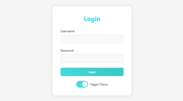
Your Dark Mode Login Form
- Use Relevant Keywords: Incorporate terms like “dark mode login form,” “CSS login design,” and “HTML login examples” in headings and content.
- Meta Tags: Ensure you use descriptive meta titles and meta descriptions (as shown in the HTML example).
- Alt Text for Accessibility: If adding images/icons, always include alt text.
- Internal Linking: Link this page to related tutorials like “responsive login form designs” or “light mode form examples.”
Primary Keywords:
- Dark mode login form
- HTML dark mode form
- CSS dark theme form
- Responsive dark login form
- Dark mode login page
Secondary Keywords:
- Modern login form design 2025
- How to create dark mode login
- Dark theme login form HTML CSS
- Login form with dark mode example
- Mobile-friendly login form
Long-Tail Keywords:
- Create a dark mode login form using HTML and CSS
- Step-by-step guide to dark theme login forms
- Best dark mode login page design 2025
- How to make a stylish login form in dark mode
- Responsive dark login form for mobile and desktop
SEO Tags (Meta Tags)
Meta Title:
“Dark Mode Login Form Tutorial 2025 | HTML & CSS Responsive Design”
Meta Description:
“Learn how to create a sleek dark mode login form in 2025 using HTML and CSS. Step-by-step guide for responsive design.”
Focus Keywords for Meta Tags:
- Dark mode login form
- HTML CSS dark theme
- 2025 login page design
good
thanks