Features of a Dark Mode Glow UI
- Dark Background: Use a deep black or dark gray base (#000000 or #121212).
- Neon Glow Effect: Add subtle, vibrant glow effects to buttons, icons, and text.
- Soft Gradients: Complement the glow with gradients for a polished look.
- Minimalistic Design: Keep clutter minimal to emphasize glowing elements.
Step-by-Step Guide for Designing Dark Mode Glow UI
1. Background Design
- Use solid dark colors like #121212, #1C1C1C, or #000000.
- Optionally, add a subtle radial gradient from black to a slightly lighter gray for depth.
- Avoid patterns or textures that could overpower glowing elements.
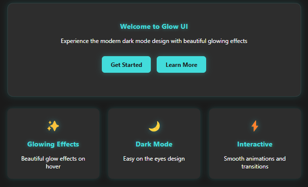
Dark Mode Glow UI
Welcome to Glow UI
Experience the modern dark mode design with beautiful glowing effects
Glowing Effects
Beautiful glow effects on hover
Dark Mode
Easy on the eyes design
Interactive
Smooth animations and transitions
Contact Us
Code…..
<!DOCTYPE html>
<html lang="en">
<head>
    <meta charset="UTF-8">
    <meta name="viewport" content="width=device-width, initial-scale=1.0">
    <title>Dark Mode Glow UI</title>
    <style>
        * {
            margin: 0;
            padding: 0;
            box-sizing: border-box;
            font-family: 'Segoe UI', Tahoma, Geneva, Verdana, sans-serif;
        }

        body {
            min-height: 100vh;
            background: #1a1a1a;
            color: #fff;
            display: flex;
            flex-direction: column;
            align-items: center;
            padding: 2rem;
        }

        .container {
            max-width: 800px;
            width: 100%;
            text-align: center;
        }

        h1 {
            font-size: 2.5rem;
            margin-bottom: 2rem;
            text-shadow: 0 0 10px rgba(66, 220, 219, 0.3);
            color: #fff;
        }

        .card {
            background: #2d2d2d;
            padding: 2rem;
            border-radius: 15px;
            margin: 1rem 0;
            box-shadow: 0 0 20px rgba(66, 220, 219, 0.2);
            border: 1px solid rgba(66, 220, 219, 0.1);
            transition: all 0.3s ease;
        }

        .card:hover {
            transform: translateY(-5px);
            box-shadow: 0 0 30px rgba(66, 220, 219, 0.4);
        }

        .button-container {
            display: flex;
            gap: 1rem;
            justify-content: center;
            flex-wrap: wrap;
            margin: 2rem 0;
        }

        .glow-button {
            background: #42dcdb;
            color: #1a1a1a;
            border: none;
            padding: 12px 24px;
            border-radius: 8px;
            cursor: pointer;
            font-size: 1rem;
            font-weight: bold;
            transition: all 0.3s ease;
            box-shadow: 0 0 15px rgba(66, 220, 219, 0.3);
        }

        .glow-button:hover {
            background: #3ac5c4;
            box-shadow: 0 0 25px rgba(66, 220, 219, 0.6);
            transform: translateY(-2px);
        }

        .glow-text {
            color: #42dcdb;
            text-shadow: 0 0 10px rgba(66, 220, 219, 0.5);
            margin: 1rem 0;
            font-size: 1.2rem;
        }

        .input-group {
            margin: 1rem 0;
        }

        .glow-input {
            background: #3d3d3d;
            border: 1px solid rgba(66, 220, 219, 0.2);
            color: #fff;
            padding: 10px 20px;
            border-radius: 8px;
            width: 100%;
            max-width: 300px;
            transition: all 0.3s ease;
        }

        .glow-input:focus {
            outline: none;
            border-color: #42dcdb;
            box-shadow: 0 0 20px rgba(66, 220, 219, 0.4);
        }

        .feature-grid {
            display: grid;
            grid-template-columns: repeat(auto-fit, minmax(250px, 1fr));
            gap: 1.5rem;
            margin: 2rem 0;
        }

        .feature-item {
            background: #2d2d2d;
            padding: 1.5rem;
            border-radius: 12px;
            box-shadow: 0 0 15px rgba(66, 220, 219, 0.2);
            transition: all 0.3s ease;
        }

        .feature-item:hover {
            transform: translateY(-3px);
            box-shadow: 0 0 25px rgba(66, 220, 219, 0.4);
        }

        .feature-icon {
            font-size: 2rem;
            margin-bottom: 1rem;
            color: #42dcdb;
            text-shadow: 0 0 15px rgba(66, 220, 219, 0.5);
        }
    </style>
</head>
<body>
    <div class="container">
        <h1>Dark Mode Glow UI</h1>

        <div class="card">
            <h2 class="glow-text">Welcome to Glow UI</h2>
            <p>Experience the modern dark mode design with beautiful glowing effects</p>

            <div class="button-container">
                <button class="glow-button">Get Started</button>
                <button class="glow-button">Learn More</button>
            </div>
        </div>

        <div class="feature-grid">
            <div class="feature-item">
                <div class="feature-icon">✨</div>
                <h3 class="glow-text">Glowing Effects</h3>
                <p>Beautiful glow effects on hover</p>
            </div>
            <div class="feature-item">
                <div class="feature-icon">🌙</div>
                <h3 class="glow-text">Dark Mode</h3>
                <p>Easy on the eyes design</p>
            </div>
            <div class="feature-item">
                <div class="feature-icon">⚡</div>
                <h3 class="glow-text">Interactive</h3>
                <p>Smooth animations and transitions</p>
            </div>
        </div>

        <div class="card">
            <h2 class="glow-text">Contact Us</h2>
            <div class="input-group">
                <input type="text" class="glow-input" placeholder="Enter your email">
            </div>
            <button class="glow-button">Subscribe</button>
        </div>
    </div>
</body>
</html>
SEO Title:
“Dark Mode Glow UI Design: Create Stunning Apps & Websites with Neon Effects (2025)”
Meta Description:
“Learn how to create a sleek and modern Dark Mode Glow UI for websites and apps. Discover step-by-step design techniques, glowing buttons, text effects, and responsive layouts!”
Focus Keyword:
Dark Mode Glow UI
LSI Keywords:
- Neon UI design
- Dark mode website
- Glowing text CSS
- Futuristic app design
- Minimal dark mode theme
- Glow effect CSS tutorial
- Neon gradient buttons
- Modern dark mode interface
SEO-Optimized Headings and Subheadings
H1:
- Dark Mode Glow UI: The Ultimate Guide to Futuristic Design
H2:
- What is Dark Mode Glow UI?
- Why Choose Dark Mode Glow UI for Websites and Apps?
- Key Features of a Glowing Dark Mode Design
H3:
- Dark Backgrounds: The Foundation of Glow UI
- Adding Neon Glow Effects to Buttons and Text
- Best Color Palettes for Dark Mode Glow UI
- Enhancing User Experience with Glowing Interactivity
- Responsive Design Tips for Glow UI
Content Placement and Focus Keyword Usage
- Keyword in Title: “Dark Mode Glow UI”
- Keyword in First 10%: Mention in the introduction, such as:
“Dark Mode Glow UI has revolutionized web and app design with its sleek, futuristic appeal.” - Keyword Density: Use the keyword 2–3 times per 500 words.
- Keyword in Subheading: For example, “Adding Neon Glow Effects to Dark Mode Glow UI.”
External Linking
Example External Link:
“Read this detailed guide on CSS Box Shadow Techniques to enhance glow effects.”
FAQs for Additional SEO Value
- What tools can I use to create a Dark Mode Glow UI?
Use Figma, Adobe XD, or Sketch for prototyping and HTML/CSS for development. - How do I make Dark Mode Glow UI accessible?
Ensure text contrast meets accessibility guidelines and avoid excessive brightness. - Can Dark Mode Glow UI work on mobile apps?
Yes, use responsive frameworks like Flutter or React Native to implement glow designs. - How can I reduce CPU load with glow effects?
Optimize CSS shadows and animations to minimize performance issues. - What are the best colors for neon glow?
Vibrant tones like teal, cyan, pink, and amber work well against dark backgrounds. - Can I add glowing animations?
Absolutely! Use CSS keyframes or JavaScript libraries like GSAP.