
how to create a dynamic, animated calculator with features like glacier background effects, bubble animations on button clicks, a clickable background changer, and dynamic animations for result displays.
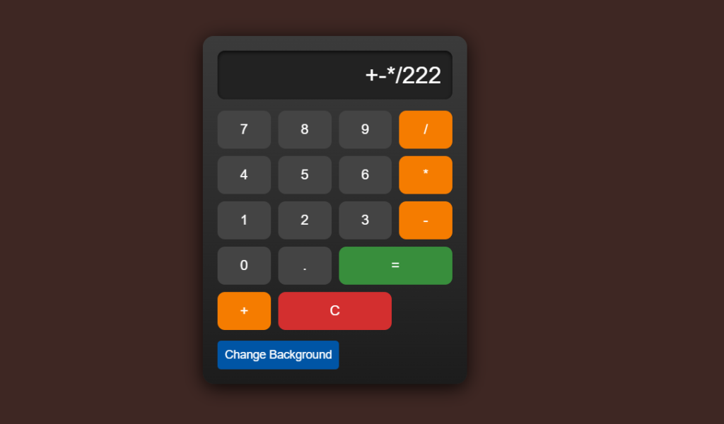
Features of the Calculator
- Dynamic Glacier Background:
A moving glacier effect creates a visually appealing environment for the calculator. - Interactive Background Changer:
Users can click a button to change the background dynamically, adding personalization to the experience. - Bubble Animations on Button Clicks:
Each button generates a bubble effect animation when clicked, providing a tactile and engaging user experience. - Dynamic Result Display Animation:
When a calculation is completed, the result is highlighted with a zoom-in animation, making the output more impactful.
Here’s an SEO-friendly article draft focusing on your unique calculator project:
Title: How to Create a Unique Calculator Using HTML, CSS, and JavaScript
Meta Description: Learn how to build a feature-rich, visually appealing calculator using HTML, CSS, and JavaScript. Includes glacier animations, dynamic backgrounds, and interactive buttons.
Introduction
Creating a calculator using HTML, CSS, and JavaScript is an excellent beginner-to-intermediate project for web developers. But why settle for a generic design? With the right features and styling, you can create a unique calculator that not only performs basic arithmetic but also delivers a visually stunning and interactive user experience.
In this article, we’ll walk you through how to create a dynamic, animated calculator with features like glacier background effects, bubble animations on button clicks, a clickable background changer, and dynamic animations for result displays.
Why Create a Unique Calculator?
- Enhanced Learning: Experimenting with advanced CSS animations and JavaScript logic helps improve your development skills.
- User Engagement: Features like animations and interactive backgrounds make your calculator more appealing to users.
- Portfolio Project: A unique calculator can serve as an impressive addition to your portfolio.
Features of the Calculator
- Dynamic Glacier Background:
A moving glacier effect creates a visually appealing environment for the calculator. - Interactive Background Changer:
Users can click a button to change the background dynamically, adding personalization to the experience. - Bubble Animations on Button Clicks:
Each button generates a bubble effect animation when clicked, providing a tactile and engaging user experience. - Dynamic Result Display Animation:
When a calculation is completed, the result is highlighted with a zoom-in animation, making the output more impactful.
Step-by-Step Guide to Creating the Calculator
1. Setting Up HTML Structure
Begin by creating the basic structure with a display section and buttons for digits, operators, and actions like clear and equals.
2. Adding CSS Styles for Design
Use CSS to style the calculator, including its display, buttons, and glacier animation.
3. Implementing JavaScript Logic
Add JavaScript to handle calculations, clear operations, and dynamic animations.
<!DOCTYPE html>
<html lang="en">
<head>
    <meta charset="UTF-8">
    <meta name="viewport" content="width=device-width, initial-scale=1.0">
    <title>Unique Calculator</title>
    <style>
        body {
            font-family: Arial, sans-serif;
            display: flex;
            justify-content: center;
            align-items: center;
            height: 100vh;
            background: linear-gradient(to right, #1c1c1c, #383838);
            margin: 0;
            overflow: hidden;
            transition: background 0.5s ease;
        }

        .glacier {
            position: absolute;
            width: 200%;
            height: 200%;
            background: url('https://i.imgur.com/QxZuz5G.png') repeat;
            animation: moveGlacier 20s linear infinite;
            z-index: -1;
        }

        @keyframes moveGlacier {
            from {
                transform: translateX(0);
            }
            to {
                transform: translateX(-50%);
            }
        }

        .calculator {
            width: 320px;
            background: linear-gradient(to bottom, #3b3b3b, #1c1c1c);
            border-radius: 15px;
            padding: 20px;
            box-shadow: 0px 5px 25px rgba(0, 0, 0, 0.8);
            z-index: 1;
        }

        .display {
            background: #222;
            color: #ffffff;
            font-size: 2rem;
            text-align: right;
            padding: 15px;
            border-radius: 10px;
            margin-bottom: 15px;
            box-shadow: inset 0px 2px 5px rgba(0, 0, 0, 0.7);
        }

        .buttons {
            display: grid;
            grid-template-columns: repeat(4, 1fr);
            gap: 10px;
        }

        .btn {
            background: #444;
            color: white;
            font-size: 1.2rem;
            border: none;
            padding: 15px;
            border-radius: 10px;
            cursor: pointer;
            transition: 0.3s;
            position: relative;
            overflow: hidden;
        }

        .btn:hover {
            background: #555;
            transform: scale(1.1);
            box-shadow: 0px 4px 10px rgba(0, 0, 0, 0.5);
        }

        .btn::after {
            content: "";
            position: absolute;
            width: 20px;
            height: 20px;
            background: rgba(255, 255, 255, 0.5);
            border-radius: 50%;
            transform: scale(0);
            animation: none;
            pointer-events: none;
        }

        .btn:active::after {
            animation: bubble 0.6s ease-out;
        }

        @keyframes bubble {
            0% {
                transform: scale(0);
                opacity: 0.5;
            }
            50% {
                transform: scale(1.5);
                opacity: 0.3;
            }
            100% {
                transform: scale(2);
                opacity: 0;
            }
        }

        .btn.operator {
            background: #f57c00;
        }

        .btn.operator:hover {
            background: #ffa726;
        }

        .btn.equal {
            background: #388e3c;
            grid-column: span 2;
        }

        .btn.equal:hover {
            background: #4caf50;
        }

        .btn.clear {
            background: #d32f2f;
            grid-column: span 2;
        }

        .btn.clear:hover {
            background: #f44336;
        }

        .btn-bg {
            background: #0055a5;
            color: white;
            font-size: 1rem;
            padding: 10px;
            margin-top: 15px;
            border-radius: 5px;
            cursor: pointer;
            border: none;
        }

        .btn-bg:hover {
            background: #0077d4;
        }
    </style>
</head>
<body>
    <div class="glacier"></div>
    <div class="calculator">
        <div class="display" id="display">0</div>
        <div class="buttons">
            <button class="btn">7</button>
            <button class="btn">8</button>
            <button class="btn">9</button>
            <button class="btn operator">/</button>
            <button class="btn">4</button>
            <button class="btn">5</button>
            <button class="btn">6</button>
            <button class="btn operator">*</button>
            <button class="btn">1</button>
            <button class="btn">2</button>
            <button class="btn">3</button>
            <button class="btn operator">-</button>
            <button class="btn">0</button>
            <button class="btn">.</button>
            <button class="btn equal">=</button>
            <button class="btn operator">+</button>
            <button class="btn clear">C</button>
        </div>
        <button class="btn-bg" onclick="changeBackground()">Change Background</button>
    </div>

    <script>
      const display = document.getElementById("display");
      const buttons = document.querySelectorAll(".btn");

      buttons.forEach((button) => {
          button.addEventListener("click", () => {
              const value = button.textContent;

              if (value === "=") {
                  try {
                      display.textContent = eval(display.textContent);
                      animateDisplay(); // Add animation to result
                  } catch {
                      display.textContent = "Error";
                  }
              } else if (value === "C") {
                  display.textContent = "0";
              } else {
                  if (display.textContent === "0" || display.textContent === "Error") {
                      display.textContent = value;
                  } else {
                      display.textContent += value;
                  }
              }
          });
      });

      function animateDisplay() {
          display.style.animation = "scaleUp 0.5s ease-in-out";
          setTimeout(() => {
              display.style.animation = ""; // Remove animation to reset for next use
          }, 500);
      }

      function changeBackground() {
          const colors = ["#1c1c1c", "#004d40", "#3e2723", "#263238", "#311b92"];
          document.body.style.background = colors[Math.floor(Math.random() * colors.length)];
      }
  </script>

  <style>
      @keyframes scaleUp {
          0% {
              transform: scale(1);
          }
          50% {
              transform: scale(1.2);
              color: #ffeb3b;
          }
          100% {
              transform: scale(1);
          }
      }
  </style>

</body>
</html>