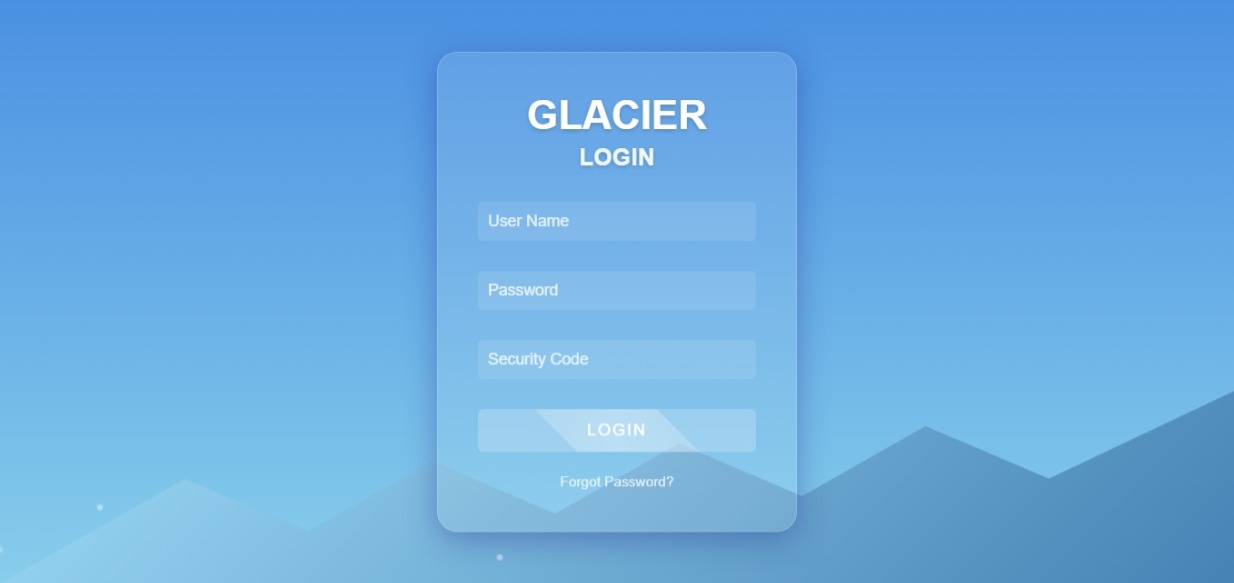
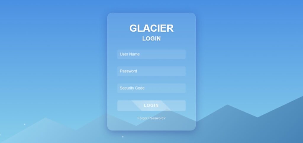
In this article, we will guide you through creating a visually appealing Glacier Login Form with snowfall animation using HTML, CSS, and JavaScript. This login form is perfect for those looking to add a unique, frosty design to their website, making it both functional and aesthetically engaging.
- Glacier Login Form
- Snowfall Animation
- HTML Login Form Design
- CSS Glassmorphism Effect
- JavaScript Animation
Features of the Glacier Login Form
Animated labels and glowing focus effects for user-friendly input fields.
Glassmorphism Design:
Transparent and blurred background for a frosty appearance.
Smooth transitions and glowing effects to enhance user interaction.
Snowfall Animation:
Realistic snowflakes falling across the screen.
Adds dynamic movement and elevates the winter aesthetic.
Responsive Layout:
Optimized for both desktop and mobile screens.
Ensures accessibility and usability on all devices.
Interactive Input Fields:
How to Create the Glacier Login Form
Below is a breakdown of the code components:
1. HTML Structure
The basic structure includes a container for the login form, input fields for username and password, and a login button.
<!DOCTYPE html>
<html lang="en">
<head>
    <meta charset="UTF-8">
    <meta name="viewport" content="width=device-width, initial-scale=1.0">
    <title>Glacier Login Form</title>
    <style>
        body {
            margin: 0;
            padding: 0;
            display: flex;
            justify-content: center;
            align-items: center;
            height: 100vh;
            background: linear-gradient(to bottom, #d8eefe, #a1c4fd, #6e93f0);
            font-family: 'Arial', sans-serif;
            overflow: hidden;
        }

        .login-container {
            position: relative;
            width: 400px;
            padding: 30px;
            background: rgba(255, 255, 255, 0.15);
            border-radius: 15px;
            box-shadow: 0 4px 15px rgba(0, 0, 0, 0.2);
            backdrop-filter: blur(10px);
        }

        .login-container h2 {
            color: #ffffff;
            text-align: center;
            margin-bottom: 20px;
        }

        .input-box {
            position: relative;
            margin-bottom: 20px;
        }

        .input-box input {
            width: 100%;
            padding: 10px 15px;
            font-size: 16px;
            color: #ffffff;
            background: rgba(255, 255, 255, 0.1);
            border: none;
            border-radius: 5px;
            outline: none;
            transition: all 0.3s;
        }

        .input-box input:focus {
            background: rgba(255, 255, 255, 0.2);
            box-shadow: 0 0 8px rgba(255, 255, 255, 0.8);
        }

        .input-box label {
            position: absolute;
            top: 50%;
            left: 15px;
            transform: translateY(-50%);
            color: #ffffff;
            font-size: 14px;
            pointer-events: none;
            transition: 0.3s;
        }

        .input-box input:focus + label, .input-box input:not(:placeholder-shown) + label {
            top: 5px;
            font-size: 12px;
            color: #a1c4fd;
        }

        .login-btn {
            width: 100%;
            padding: 10px;
            font-size: 16px;
            color: #ffffff;
            background: #6e93f0;
            border: none;
            border-radius: 5px;
            cursor: pointer;
            transition: background 0.3s;
        }

        .login-btn:hover {
            background: #a1c4fd;
        }

        .glacier-effect {
            position: absolute;
            top: -50%;
            left: -50%;
            width: 200%;
            height: 200%;
            background: radial-gradient(circle, #ffffff22, #ffffff00 60%);
            transform: rotate(45deg);
            animation: glacier-move 6s infinite linear;
            pointer-events: none;
        }

        @keyframes glacier-move {
            0% {
                transform: rotate(45deg) translate(0, 0);
            }
            100% {
                transform: rotate(45deg) translate(50%, 50%);
            }
        }

        .snowflake {
            position: absolute;
            top: -10px;
            color: #ffffff;
            font-size: 1em;
            animation: fall linear infinite;
            opacity: 0.8;
        }

        @keyframes fall {
            0% {
                transform: translateY(0) rotate(0deg);
                opacity: 1;
            }
            100% {
                transform: translateY(100vh) rotate(360deg);
                opacity: 0;
            }
        }
    </style>
</head>
<body>
    <div class="login-container">
        <div class="glacier-effect"></div>
        <h2>Glacier Login</h2>
        <div class="input-box">
            <input type="text" required placeholder=" ">
            <label>Username</label>
        </div>
        <div class="input-box">
            <input type="password" required placeholder=" ">
            <label>Password</label>
        </div>
        <button class="login-btn">Login</button>
    </div>

    <script>
        const body = document.body;

        function createSnowflake() {
            const snowflake = document.createElement('div');
            snowflake.classList.add('snowflake');
            snowflake.textContent = '❄';
            snowflake.style.left = Math.random() * window.innerWidth + 'px';
            snowflake.style.animationDuration = Math.random() * 3 + 2 + 's';
            snowflake.style.fontSize = Math.random() * 10 + 10 + 'px';

            body.appendChild(snowflake);

            setTimeout(() => {
                snowflake.remove();
            }, 5000);
        }

        setInterval(createSnowflake, 100);
    </script>
</body>
</html>
Focus on Keywords:
Use relevant keywords such as “Glacier Login Form,” “Snowfall Animation,” and “Glassmorphism Login Design” naturally throughout the content.
Meta Description:
Write a concise description like:
“Learn how to create a stunning Glacier Login Form with snowfall animation using HTML, CSS, and JavaScript.”
Image Optimization:
Include screenshots of the login form and optimize image alt tags with focus keywords.
Internal Linking:
Link to related pages or tutorials, such as “How to Add Animations in CSS” or “10 Best Login Form Designs.”
Page Speed:
Minimize CSS and JavaScript files to ensure fast loading.
Pingback: How To Create a Calculator Using HTML CSS & JavaScript 2025 - ThinkCrft
Pingback: How to Create a Stopwatch with HTML, CSS, and JavaScript 2025 - ThinkCrft