Introduction
In modern web design, interactive elements enhance user engagement. One such effect is the flipping credit card UI, which provides a smooth 3D flip animation on hover. This tutorial will guide you through creating a flipping credit card UI using HTML and CSS.
Features of the Flipping Credit Card UI
✅ 3D Flip Animation on Hover
✅ Front & Back Side for Realistic Design
✅ Gradient Background for a Modern Look
✅ Responsive Design for All Devices
✅ Smooth CSS Transitions
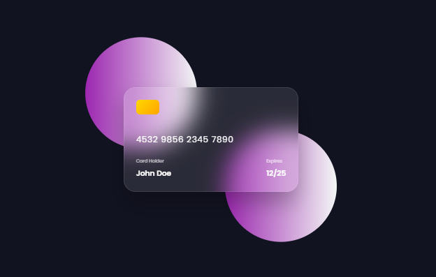
4532 9856 2345 7890
Card Holder
John Doe
Expires
12/25
CVV
123
Steps to Create a Flipping Credit Card UI
1. HTML Structure
We need a container that holds the card, with separate front and back sides.
h<!DOCTYPE html>
<html lang="en">
<head>
    <meta charset="UTF-8">
    <meta name="viewport" content="width=device-width, initial-scale=1.0">
    <title>Flipping Credit Card UI</title>
    <link rel="stylesheet" href="styles.css">
    <link href="https://fonts.googleapis.com/css2?family=Space+Grotesk:wght@300;400;500&display=swap" rel="stylesheet">
    <style>
      /* Import Google Font - Poppins */
@import url("https://fonts.googleapis.com/css2?family=Poppins:wght@300;400;500;600&display=swap");

* {
    margin: 0;
    padding: 0;
    box-sizing: border-box;
    font-family: "Poppins", sans-serif;
}

body {
    min-height: 100vh;
    width: 100%;
    background: #121321;
    display: flex;
    align-items: center;
    justify-content: center;
    color: #fff;
    position: relative;
}

body::before {
    content: "";
    position: absolute;
    height: 240px;
    width: 240px;
    border-radius: 50%;
    transform: translate(-150px, -100px);
    background: linear-gradient(90deg, #9c27b0, #f3f5f5);
}

body::after {
    content: "";
    position: absolute;
    height: 240px;
    width: 240px;
    border-radius: 50%;
    transform: translate(150px, 100px);
    background: linear-gradient(90deg, #9c27b0, #f3f5f5);
}

.container {
    position: relative;
    height: 225px;
    width: 375px;
    z-index: 100;
    perspective: 1000px;
}

.card {
    position: relative;
    height: 100%;
    width: 100%;
    cursor: pointer;
}

.card-inner {
    position: absolute;
    width: 100%;
    height: 100%;
    transform-style: preserve-3d;
    transition: transform 0.6s;
}

.card:hover .card-inner {
    transform: rotateY(180deg);
}

.card-front,
.card-back {
    position: absolute;
    height: 100%;
    width: 100%;
    padding: 25px;
    border-radius: 25px;
    backdrop-filter: blur(25px);
    background: rgba(255, 255, 255, 0.1);
    box-shadow: 0 25px 45px rgba(0, 0, 0, 0.25);
    border: 1px solid rgba(255, 255, 255, 0.1);
    backface-visibility: hidden;
}

.card-front {
    display: flex;
    flex-direction: column;
}

.card-front header {
    display: flex;
    justify-content: space-between;
    align-items: center;
}

.chip {
    width: 50px;
    height: 40px;
    background: linear-gradient(135deg, #ffd700, #ffa500);
    border-radius: 8px;
    margin-bottom: 20px;
}

.card-number {
    font-size: 18px;
    letter-spacing: 1px;
    margin: 20px 0;
}

.card-info {
    display: flex;
    justify-content: space-between;
    margin-top: auto;
}

.card-holder span,
.card-expiry span {
    font-size: 10px;
    opacity: 0.7;
}

.card-holder h3,
.card-expiry h3 {
    font-size: 16px;
    margin-top: 5px;
}

.card-back {
    transform: rotateY(180deg);
}

.magnetic-strip {
    position: absolute;
    top: 40px;
    left: 0;
    height: 45px;
    width: 100%;
    background: #000;
}

.cvv-container {
    margin-top: 120px;
    padding: 0 20px;
}

.cvv-text {
    font-size: 10px;
    opacity: 0.7;
}

.cvv {
    width: 50px;
    height: 30px;
    background: white;
    color: black;
    display: flex;
    align-items: center;
    justify-content: center;
    border-radius: 4px;
    font-size: 14px;
    margin-top: 5px;
}

@media (max-width: 450px) {
    .container {
        width: 300px;
        height: 180px;
    }

    .card-number {
        font-size: 16px;
    }

    .card-holder h3,
    .card-expiry h3 {
        font-size: 14px;
    }
}
    </style>
</head>
<body>
    <div class="container">
        <div class="card">
            <div class="card-inner">
                <!-- Front of the card -->
                <div class="card-front">
                    <div class="chip"></div>
                    <div class="card-number">4532 9856 2345 7890</div>
                    <div class="card-info">
                        <div class="card-holder">
                            <span>Card Holder</span>
                            <h3>John Doe</h3>
                        </div>
                        <div class="card-expiry">
                            <span>Expires</span>
                            <h3>12/25</h3>
                        </div>
                    </div>
                </div>
                <!-- Back of the card -->
                <div class="card-back">
                    <div class="magnetic-strip"></div>
                    <div class="cvv-container">
                        <div class="cvv-text">CVV</div>
                        <div class="cvv">123</div>
                    </div>
                </div>
            </div>
        </div>
    </div>
</body>
</html>
flipping credit card UI
Learn how to create a flipping credit card UI using HTML & CSS with a 3D hover flip animation. This tutorial includes a responsive design, modern gradient styling, and a realistic front & back card layout with a smooth flipping effe
- Flipping Credit Card UI
- HTML CSS Flip Card
- CSS 3D Flip Animation
- Credit Card Design
- Responsive UI Design
- CSS Hover Effects
- Card UI in HTML
- Interactive Card Design
- Front & Back Card Flip
- Modern Web Design


Pingback: How to Create a Google Gemini AI Chatbot Using HTML, CSS, and JavaScript 2025 - ThinkCrft